24
$\begingroup$

So I just figured out that stack exchange exists like 2 months ago and I am now just getting active in the wonderful world of cross validated and its great.

One thing I came across just now is I spent 10 minutes trying to figure out why I could not accept an answer. I was thinking I did not have the privilege, but I looked at the list and it is not on there (why would it be, you should be able to accept answers if you can ask questions). Then I sorted out that I had accepted an answer, but the color change from the grayed out check mark to the accepted check mark does not tickle the cones in my eye enough for me to notice the difference (rather, one set of cones in my eye is on permanent vacation and the other cones can't be bothered to take over the work, slackers, I know).

I realize that I can just hover over it and it will say accepted x amount of time ago, so its not the end of the world, but red/green color blindness is pretty common (other color blind folks would likely have an issue as well), so I was wondering if it would be possible to make it a different color (a darker more pronounced green would do it for me, though I can't speak for all color blind people). For an example of something that works, check out the darker green in stack overflow, that works just fine for me, though it might not fit the layout of cross validated as well.

I guess a color blind mode would solve the problem as well, but that seems like a bit of overkill, given that the only time it has bugged me so far is on the accept answer check.

Thank you for your consideration.

$\endgroup$
12
  • 8
    $\begingroup$ Thank you for bringing this to our attention. (I usually check for possible red/green confusion, but it did not occur to me that green could be confused with gray!) Perhaps @Jin could take a look? Probably a solution could be as simple as using the same (dark) green for the checkmark as for the voting symbols. $\endgroup$
    – whuber Mod
    Commented Feb 29, 2012 at 18:56
  • $\begingroup$ Thanks for the response. Its strange when it comes up. The only times it matters for me is the red green color blind test (you know the circles), stop signs obscured by leaves (whoops!) and occasionally on websites. Hard to quantify exactly when on websites and it generally doesn't matter, but the fix is usually painless. I am terrible at color matching games though. $\endgroup$
    – asjohnson
    Commented Feb 29, 2012 at 19:21
  • $\begingroup$ I totally agree with asjohnson's as I have the same problem. Please do something about it. Darker green and or clearly lighter grey would be great (I think the best would be to change both colours). For me the basic issue is also that there is too little contrast between the colors. $\endgroup$
    – Henrik
    Commented Mar 4, 2012 at 14:21
  • $\begingroup$ Could this be fixed by, e.g. use of a larger tick mark when the answer has been accepted, or adding in a title "Accepted Answer" above the relevant answer? It would appear that a change in the form used to identify the accepted answer might be more useful. $\endgroup$
    – Michelle
    Commented Mar 26, 2012 at 3:02
  • $\begingroup$ I imagine a larger tick mark would be more noticable and text would be another solution that would get it done. I guess I would have to check the specific solution to be certain, but I don't see why either of them would not work. $\endgroup$
    – asjohnson
    Commented Mar 26, 2012 at 13:51
  • 6
    $\begingroup$ +1 It's a reasonable request--designers ought to pay attention to this issue. In the meantime, note that when you hover the mouse over an arrow corresponding to a vote you already cast, the hovertext will end in "(click again to undo)". $\endgroup$
    – whuber Mod
    Commented Sep 4, 2015 at 14:56
  • 5
    $\begingroup$ I am confused by what you mean by saying that I have already had my votes locked on a few questions by trying to up-vote them when they were already up-voted. Trying to upvote an already upvoted or downvoted question does not lead to any consequences! You get a notification saying that your vote is locked. The vote is locked automatically after a short delay (I think it's 5 min) following the original voting; it is not the attempt to re-vote that locks it! $\endgroup$
    – amoeba
    Commented Sep 4, 2015 at 15:13
  • $\begingroup$ @amoeba thanks. That makes sense. I was confused by the message I was getting. Anyway I think I up-voted and then forgot and tried again because it looked similar to the neutral color. $\endgroup$
    – pbible
    Commented Sep 5, 2015 at 1:50
  • 2
    $\begingroup$ I'm not color blind but I have one crummy monitor that I can't tune really well so gradients are always washed out. On that monitor the colors are very close, and it is worse on Meta. $\endgroup$
    – Erik
    Commented Sep 18, 2015 at 17:20
  • $\begingroup$ @whuber I'd like to add that I too have trouble distinguishing between a pressed and unpressed vote arrow, as the color contrast ratio (CR) between the two is extremely poor. On the main site, the colors are Unpressed #818185 : #027187 Pressed, CR = 1.46:1, and on Meta, Unpressed #818185 : 3b3b3b Pressed, CR = 2.89:1. Both are failing ratios according to WCAG, which requires 4.5:1. Using [Flux](justgetflux.com) at night makes the CR even worse, due to the faint blue tinge of the buttons getting completely erased. $\endgroup$ Commented Sep 29, 2015 at 21:39
  • 1
    $\begingroup$ @AnnaLear, could you explain what has changed, after the tag status-completed was added into this question? We were talking about this in the chat (ten fold room), but we couldn't figure it out. Thanks. $\endgroup$ Commented Oct 7, 2015 at 12:49
  • 1
    $\begingroup$ @AndreSilva ... I was on the wrong post. Sorry about that. $\endgroup$
    – Adam Lear StaffMod
    Commented Oct 7, 2015 at 13:55

2 Answers 2

7
$\begingroup$

Maybe, there is a workaround for this.

I am using Stylish on Chrome to visualize accepted-answers on CV exactly equal to Stack Overflow. I think the green color used on the main site is too light.

The bellow code is a summary of what I got from blah238's answer on GIS SE, and Brock Adams's answer on Stack Overflow SE. And there is also the Old CheckMark's answer on Meta Stack Overflow SE.

Here it goes:

1- Install the Stylish on Google-Chrome (it can be used with Mozilla Firefox too, but not sure about other web navigators).

2- Type on Stylish the following code:

div.status.answered-accepted, div.status.answered-accepted strong {  
background: rgb(117, 132, 92) !important;  
color: #e1e818 !important;  
}  

.answered-accepted {  
    background-color: rgb(117, 132, 92) !important;  
    color: #e1e818  
}  

.vote .vote-accepted-on {  
background-image:   url(data:image/png;base64,/9j/4AAQSkZJRgABAQAAAQABAAD/2wBDAAcFBQYFBAcGBQYIBwcIChELCgkJChUPEAwRGBUaGRgVGBcbHichGx0lHRcYIi4iJSgpKywrGiAvMy8qMicqKyr/2wBDAQcICAoJChQLCxQqHBgcKioqKioqKioqKioqKioqKioqKioqKioqKioqKioqKioqKioqKioqKioqKioqKioqKir/wAARCAAoACgDASIAAhEBAxEB/8QAGwABAAMAAwEAAAAAAAAAAAAAAAIEBwMFBgj/xAAwEAACAQIFAwAJBAMAAAAAAAABAgMABAUGESFBEjFRBxMyQlJxgaHBFiI2YXSz4f/EABgBAAMBAQAAAAAAAAAAAAAAAAABBAID/8QAGxEAAwEBAQEBAAAAAAAAAAAAAAEDAhIRYSH/2gAMAwEAAhEDEQA/APpGlUcVxmywVLaTEZfUxXE4gEh9lGIJBY8D9umvGu+2pF6l6L1CuC9vbbDbGW8vplht4V6nduwH5PAHcml7e22G2Mt5fTLDbwr1O7dgPyeAO5NYfnHONzmi+6VDQ4fC2sMBO5Pxt5b7AbDknnSiwvpyrVTX01rKmY/1PY3d6kPqYY7poYVPtFAqnVuNSSe3btv3Kuk9E8UkeUJmdGVZLx2QkaBh0oNR5GoI+YNK1Nt5TZqbbwmyPpb/AIlbf5yf65K8/kb0hLhkK4Zj8rG0RdILjQsYgPcIG5XxyO3b2dMxnBrLHsMkscRi64n3BGzRtwyngj/h1BIrCsy5avcsYmbW7HXE+pgnUaLKv4I5HH9ggmevWNdont3jfaLmcc43OaL7pUNDh8LawwE7k/G3lvsBsOSb+RsjSZgmW/xJWjwyNth2NwR7o8L5P0G+pDI2RpMwTLf4krR4ZG2w7G4I90eF8n6DfUjZooo4IUihRY441CoiDQKBsABwKU5vb72ZlJ0fexFFHBCkUKLHHGoVEQaBQNgAOBSpUqwuFU8UwmxxqxNpilstxAWDdJJBBHYgjcH5cEjmlKGvRNJ/jLUUUcEKRQosccahURBoFA2AA4FSpSgYpSlAH//Z);
background-position: 0% 0%;  
}

The last part of the code refers to altering the checkmark. The checkmark image provided in the code is cutted a little bit but Brock Adams's answer provide an alternative way to one upload an own picture that can be used with background-image argument (the image needs to be uploaded on the server already with the desired color/aspect).

3- Still on Stylish set the "Applies to" field to:

URL starting with --> https://stats.stackexchange.com/

To set the webpage domain using Stylish on Firefox see blah238's answer and follow the comments.

Here are some examples/screenshots for the above code: 1, 2 and 3.

I hope this can help you.

$\endgroup$
1
  • 3
    $\begingroup$ This is a great work around, but alas it is just a work around. It would be nice if a more general solution was made by the design team. Given this question has been open since '12, you provided the work around in '13, and 2+ years later nothing has been changed, I don't have much hope it will be addressed.... $\endgroup$
    – Erik
    Commented Sep 23, 2015 at 23:09
7
$\begingroup$

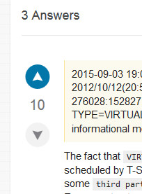
Arrow picture

The above was clipped from DBA.SE.

Putting a circle/something around the arrow seems like a good move to me. That would make the distinction clear for users with bad monitors and/or are color blind. I vote we go this route.

$\endgroup$
5
  • $\begingroup$ Something like this would definitely solve my problem. Good answer. $\endgroup$
    – pbible
    Commented Sep 22, 2015 at 14:35
  • $\begingroup$ Personally, I don't like the aesthetic. I'm not looking forward to a circle around a normal distribution. I do agree that we should have a colorblind safe design. I wonder if we could come up with something else. $\endgroup$ Commented Sep 22, 2015 at 21:25
  • 2
    $\begingroup$ @gung A circle is just an example that is why I added "something" too. It might be fun to skew the normal distribution right after an up-vote, and left after a down-vote, but that isn't great either.... I think the principal of making a more impactful change than a color shift is sound though. $\endgroup$
    – Erik
    Commented Sep 22, 2015 at 21:28
  • 1
    $\begingroup$ Skewed distributions are a cute idea. I wonder how distinctive they'd look. $\endgroup$ Commented Sep 22, 2015 at 21:56
  • 3
    $\begingroup$ Looking the grpahic design stackexchange they have a filled vs non-filled shape for up and down. Maybe going from 1 distribution to two overlapped distributions would be cool. $\endgroup$
    – pbible
    Commented Sep 24, 2015 at 16:26

You must log in to answer this question.

Not the answer you're looking for? Browse other questions tagged .