9
$\begingroup$

My question is simple theoretically, but probably not so simple practically...

Is there a way to check the distribution of question votes vs answer votes on CV? My assumption is that people are more likely to vote on questions because they do not always require expertise to upvote, whereas for an answer there is a need to understand both the question and the answer content matter in order to rightfully judge how meaningful the answer is. Hence my assumption is that people vote less on answers than they do questions. There are probably other variables here that would also be interesting, but I somehow doubt that stuff would be available to normal users of CV.

I think it would be interesting to get a sense of the psychology of voting here, but otherwise it isn't a life or death question for me.

$\endgroup$
4
  • 3
    $\begingroup$ Damn. I would say I vote mostly on answers than question! In any case you can check the Data Explorer to play with the tools available and there is also some privilege for 25k users (not aware of the specifics). $\endgroup$ Commented Nov 3, 2023 at 1:28
  • $\begingroup$ Mine has shifted since originally coming here. I used to vote on well-thought questions with no obvious close/formatting issues. Now I vote a lot more on answers as my knowledge of these topics has increased. But I also had a very poor understanding of statistics when I first came here, and I am only marginally better now. $\endgroup$ Commented Nov 3, 2023 at 2:08
  • 1
    $\begingroup$ The Data Explorer is the place to look. But since c. 2015, there have routinely been about 60 to 80% more questions than answers but only about 30% more votes on questions than on answers. $\endgroup$
    – whuber Mod
    Commented Nov 3, 2023 at 2:33
  • 2
    $\begingroup$ We should upvote decent questions more! stats.meta.stackexchange.com/questions/6304/my-upvoting-policy . +1 to yours. $\endgroup$
    – mkt
    Commented Nov 3, 2023 at 17:49

1 Answer 1

14
$\begingroup$

Stackexchange/Stackoverflow provides archives of the database as well as a page that allows to write and execute SQL scripts that access the latest database dump. The webpage for the latter is data.stackexchange.com

An example of extracting information about votes is in this q&a: https://stats.meta.stackexchange.com/a/5336/

It links to a script like this which creates images such as this:
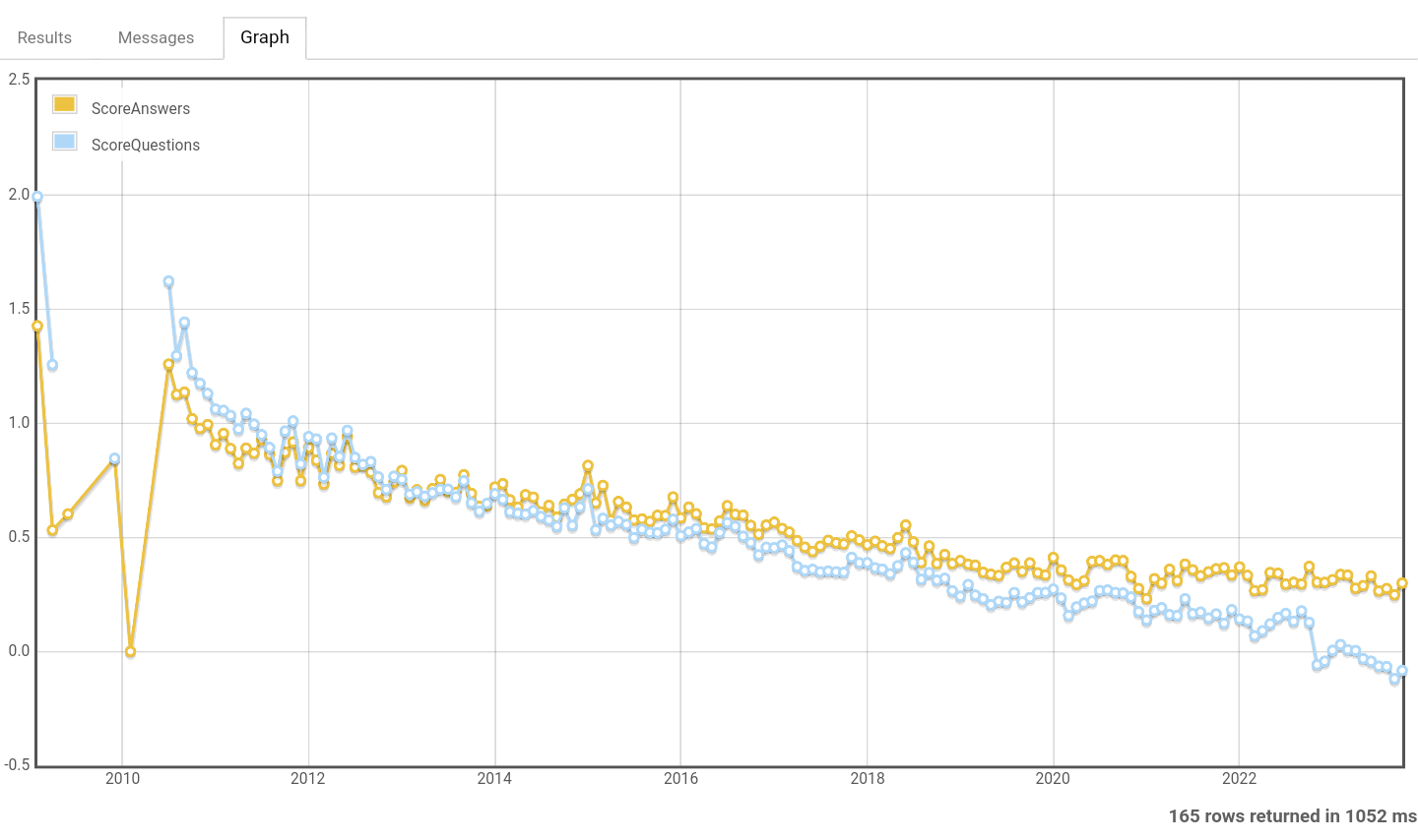
example

This graph shows that among the new posts the answers receive relatively more votes than the questions.

This can be due to a mixture of causes. Potentially the users have changed in their voting behaviour, but it may also have to do with the age of the questions and newer questions are also less old. Relating to age: it is possible that questions receive less votes early and more later. Also, among questions there might be more low quality posts that get removed in time, that is in particular visible in the gap at the end of the curve where questions that are less than 1 year old have on average a much lower score (among questions older than 1 year the bad, low score, questions are removed, this happens automatically after 1 year).

It is also possible to analyse the votes based on a specific time period, like the number of votes received in the first X days. In that way the age of the questions has no influence as the votes are all recorded for the same age of X days. Below is an example for 30 days.
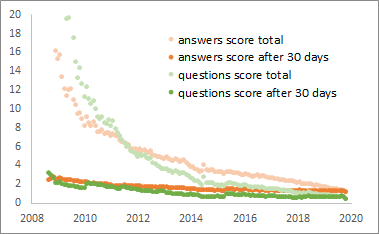
old posts with high scores

That image above is from this meta post Is the voting and reputation system sustainable? How can we improve it or maybe it should be replaced? which includes several more ways of analysing the distribution in votes.

An intriguing example is the distribution of the mean of votes for answers as function of the time of the day that the answer and the corresponding question had been posted. (the effect is so strong in the image because it relates to the statistics for a language related StackExchange which makes it more strongly tied to a particular location/longitude on Earth)
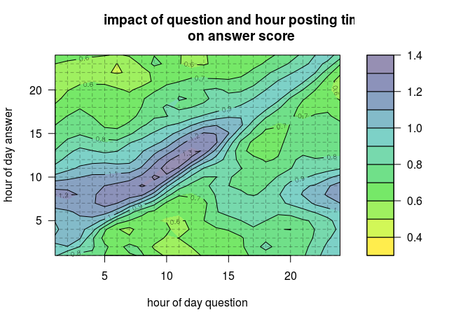
the impact of question and answer posting time on answer score

$\endgroup$
4
  • $\begingroup$ Very cool. On a side note, any idea why there is that gap in the question scores on the left of the plot? $\endgroup$ Commented Nov 3, 2023 at 10:33
  • 2
    $\begingroup$ @ShawnHemelstrand that gap is about one year in size. After one year the questions with a low score and no answers get removed. That increases the average score. $\endgroup$ Commented Nov 3, 2023 at 11:27
  • 2
    $\begingroup$ @ShawnHemelstrand I see now that the previous comment explained the gap on the right whereas the comment should have explained the gap on the left. That gap on the left is because there were only 18 questions and answers in 2009, and the SQL code grasps values for each month when there is at least a question or answer. This creates datarows with potential sparsity which appear as gaps in the scatter/graph-plot. $\endgroup$ Commented Nov 7, 2023 at 13:42
  • $\begingroup$ Ah thanks for adding that. Makes sense. $\endgroup$ Commented Nov 7, 2023 at 14:07

You must log in to answer this question.

Not the answer you're looking for? Browse other questions tagged .