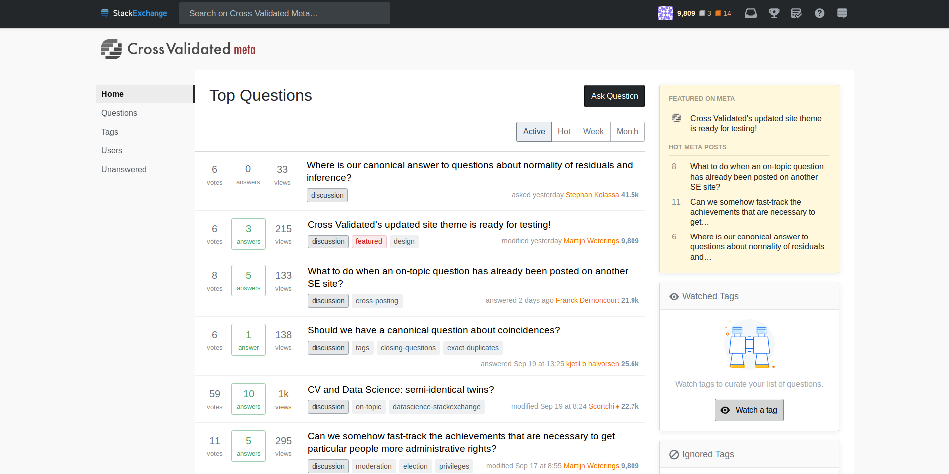
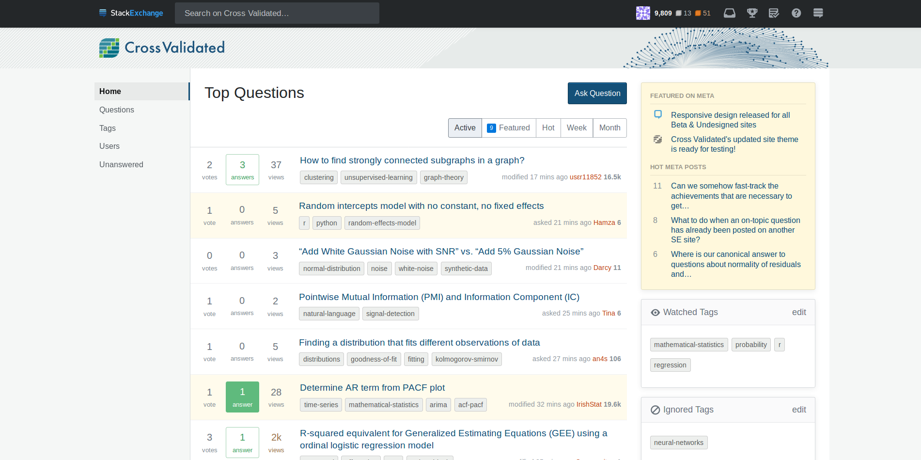
I liked the way how themes for meta and non-meta where different. With the currently similar themes I get confused and this is annoying because the menu's for navigation are different between meta and non-meta. It has become less clear what site I am one.
If you make different sites and navigation menu's then why not also different themes?
From this point of view I do not get why sites should have completely similar looks?
"the new unified themes across the network" what does that mean? Does it mean unified in the backend or will it also mean unified for the frontend?
- Is the idea to have the similar (looking) themes only temporarily, due to a reset of the themes, e.g. because of some changes in the background (and stats can look different again later on)?
- or is the idea to make the themes more permanently similar because some people have decided that the customized front end themes should be more similar?
NEW
###NEW https://stats.meta.stackexchange.com/
https://stats.stackexchange.com/
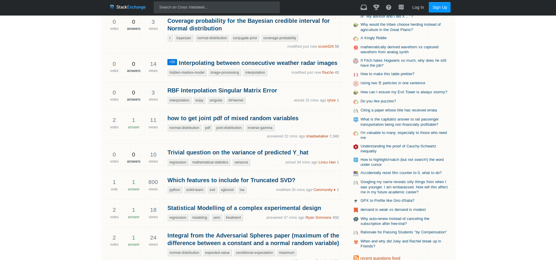
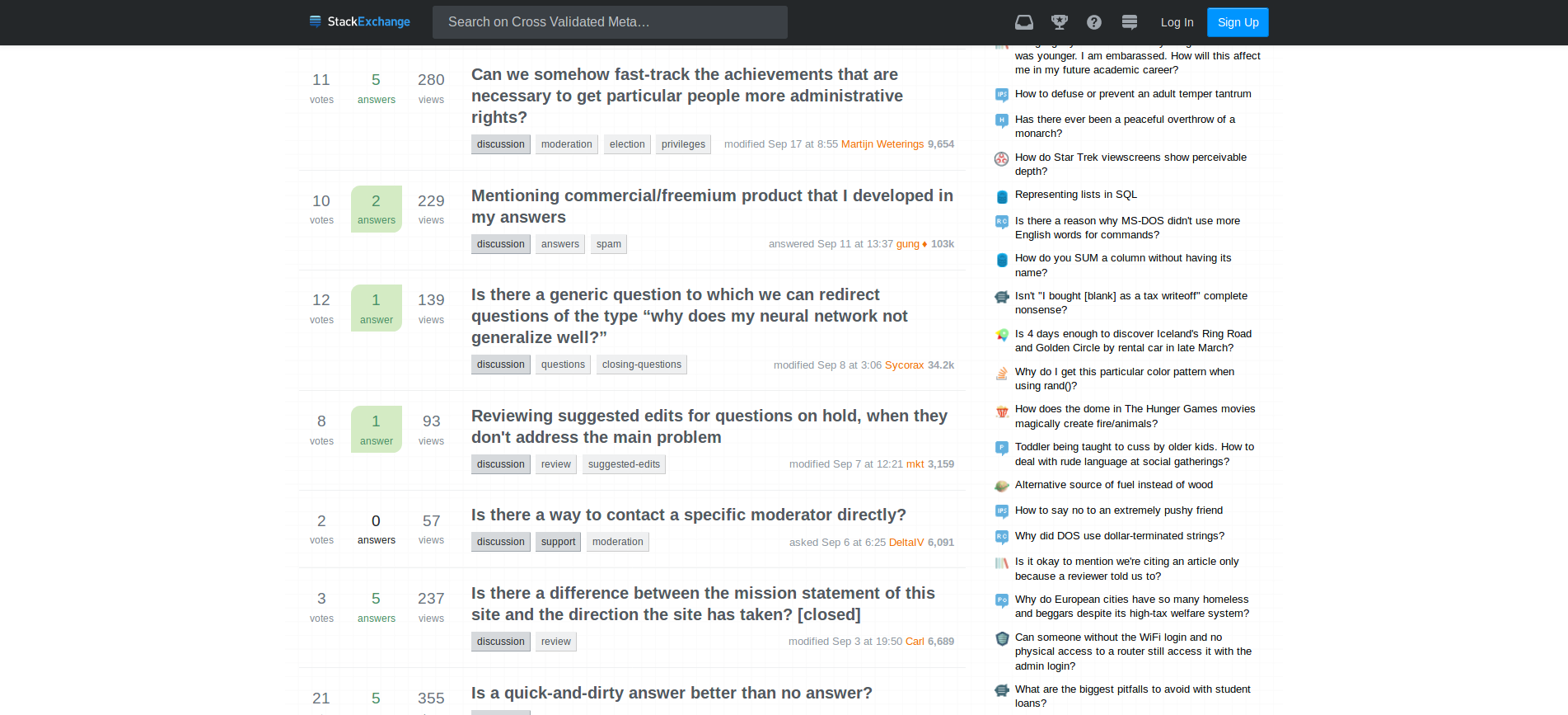
###OLD
OLD
I think that the difference for me with the old designs was that stats.meta had a uniform background and stats had a non-uniform background (ie a contrast between the center/middle panel and the sides). So even though the background is only a faint pale colour it was a distinctive difference because of the contrast with the sides.


